Grepr: Building blog measurement infrastructure from scratch
Client: Grepr, a Series A observability startup focused on full-fidelity telemetry at a fraction of the cost
Engagement type: Ongoing fractional GTM, content and marketing leadership
Scope of this story: Analytics foundation and blog performance reporting
The setup
Eighty-three blog posts live on grepr.ai covering observability cost reduction, pipeline architecture, competitive comparisons, and product launches. Traffic was coming in, and the team knew the blog was doing something. Nobody could point at a specific post and say this one is worth doubling down on, or trace a reader's path and say this channel is the one carrying us.
When the founder asked how the blog was performing, the team answered with a gut check. Nobody could open a report and point at the numbers.
There was no view that separated blog traffic from sitewide noise. No way to rank posts by actual engagement instead of raw pageviews. No way to trace where a reader went after finishing a post, whether LinkedIn and organic search were driving qualified audiences, or how the weekly trend lined up against the publishing cadence.
Content was being produced in good faith. The decisions about what to produce next were being made on vibes.
What I built
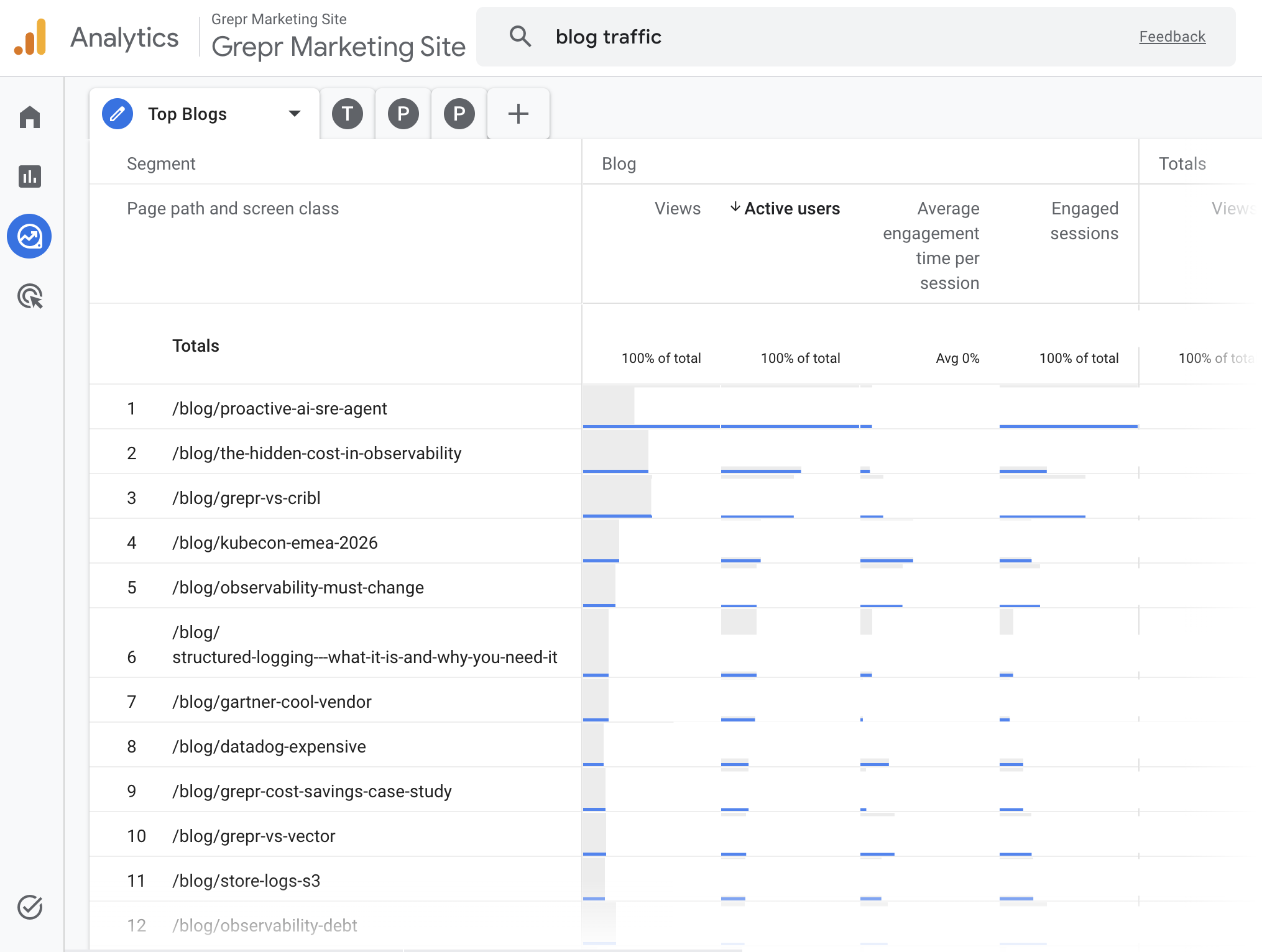
A Blog Performance Dashboard in GA4 with four working views.
Top posts by engagement. Every post ranked across views, active users, average engagement time, and engaged sessions. Views alone lie. A post with 40 views and a 48-second read tells you something different than a post with 200 views and a 5-second bounce, and the dashboard makes the difference visible.
Traffic sources with nested detail. Channel groups like Direct, Organic Search, Organic Social, and Paid sit at the top level. Click any channel and the specific sources expand underneath, so LinkedIn referrals versus Twitter versus Gemini versus Reddit all become legible in one place.
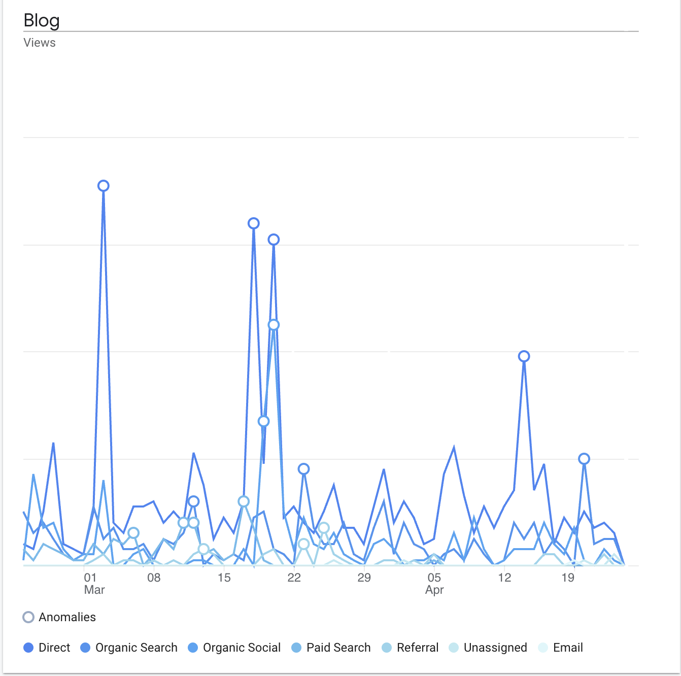
Performance over time with channel breakdown. Daily blog views charted across the full date range, segmented by channel, with GA4 anomaly detection flagging real spikes above baseline. Every spike lines up with something specific: a LinkedIn post, a product launch, a conference day, an email send.
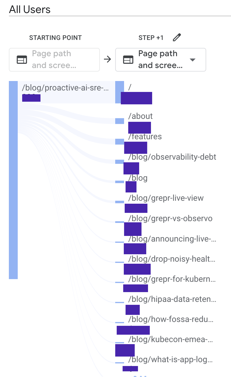
Post-blog path analysis. For any given post, a flow diagram showing where the next session hit landed. Homepage, features page, another blog post, or exit. Useful for understanding which content is actually pulling readers toward the product and which content is just drawing eyeballs and releasing them.
Every view filters strictly to blog URLs. The whole dashboard lives in the shared workspace, where anyone on the team can open it, change the date range, and get the same answer.
What the dashboard made visible
Traffic spikes are not random
Within the first 60 days of measurement, every anomaly flagged by GA4 mapped to a specific campaign action: a product launch, a LinkedIn post from the founder, a conference day, an email send. Nothing was accidental. That matters because it tells the team which distribution moves are actually generating traffic, which ones are noise, and which ones to repeat. Before the dashboard, the team had a general sense that LinkedIn mattered. After the dashboard, they could point at a specific post and trace the traffic it drove.
Engagement time changes which posts win
Pageviews tell you what got clicked. That is a different question from what got read. When you sort the same content library by average engagement time instead of raw traffic, the rankings shuffle. Some high-traffic posts turn out to be losing readers in under ten seconds, while some lower-traffic posts are holding attention for nearly a minute. The second group is where the strategic value lives, and it was invisible before.
Some content types pull higher-intent readers than others
When engagement time and pageviews both spike on the same post, that is a signal. It means the post is attracting the right audience and holding their attention long enough for the message to land. The dashboard surfaced which categories of content produce that combination consistently, which made the Q2 content bet much easier to place. Less guessing about what to invest in next.
The gap between traffic and conversion became measurable
Path analysis showed where readers go after the blog. In aggregate, they move to product pages, other blog posts, or exit. What was conspicuously absent was any meaningful flow from blog to demo request or contact, which meant readers who engaged were moving toward the company and then the site was dropping them before the handoff. This finding is now a separate priority for the next phase of work, and it would have been invisible without the dashboard.
The ongoing engagement
Grepr is a continuing client. Content strategy, SEO, event marketing, product launches, LinkedIn presence, paid coordination, and website input all live under the engagement. The measurement work sits underneath everything else now, which means new posts and event content get evaluated against a real baseline instead of last quarter's hunches. Monthly reports to the COO and CRO start from the same dashboard, so conversations about what to do next start from shared ground instead of disagreement about what actually happened.
Analytics infrastructure is the part of marketing that nobody writes LinkedIn posts about. It disappears into the background when it works, surfaces only when someone asks a question the data cannot answer, and rarely shows up in a recap next to campaign creative or launch coverage. The work still has to get done. Without it, every content dollar and every campaign hour gets spent on instinct, and six months later nobody can tell you whether any of it mattered.
At Grepr, the foundation is in place. The next 60 days focus on a 20 percent lift in blog views, a rewrite pass on the four top-10 posts losing readers in under 10 seconds, and a site-level push on conversion paths that the path analysis made impossible to ignore.